
Mobile App
Helping people interested in the San Francisco Zen Center easily find and listen to recorded talks at any time on a mobile device.
User Experience
Visual Design
Roles & Responsibilities
I chose to do this project as part of my UX Design training. I wanted to choose a project that had the potential to become something real in the world and something I could eventually present to the San Francisco Zen Center for possible development. I conducted the planning, research, prototyping, design and testing with the help of a mentor, so that I could gain a comprehensive understanding of the entire design process. I also chose to design an app, because, I had never attempted to design an app before. It felt like a good challenge, full of many unknowns.
The project took about 8 months to complete, working nights and weekends outside of my regular full-time job. While I completed the visual design for the app entirely on my own, I took inspiration from the San Francisco Zen Center’s existing branding.
Problem
The existing recorded talks available on the San Francisco Zen Center website are not easily searchable and it can be difficult to find out more information about the speakers.

Understanding the Users
The end users were primarily lay practitioners (people who do not live in a monastery) and those generally interested in Zen Buddhism.
I got to know them by first sending out a Survey, then setting up phone interviews.
What is unique about this group of people is their use of technology every day to connect them to their interests in Zen and learn more about Buddhism. While not technically advanced users, they are comfortable with technology.
In addition to surveys and interviews, I also conducted a competitive analysis and discovered that other apps already existed for organizations similar to the San Francisco Zen Center and that these apps made listening to and searching for talks much easier. This led me to conclude that the experience of listening to talks from the San Francisco Zen Center could be vastly improved. I also concluded that since the number of talks would only be increasing, the need for a better experience would become more important.

User flows and wireframes
After the research phase, I did rough sketches of the potential app to determine the user flows. I then turned these into wireframes using Sketch to get a better idea of what the experience could look like. Once I had mapped out the possible user flows I turned my wireframes into an interactive prototype using InVision.
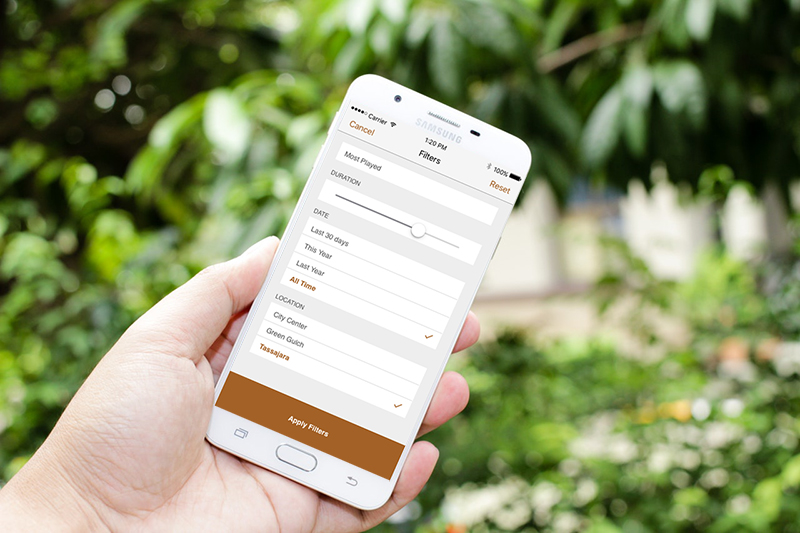
With the interactive prototype, I was able to conduct user testing in order to understand what was clear and what was confusing to someone using the potential app. For example, it became very clear to me that the search functionality I initially designed was confusing and not very helpful. After a lot of research and experimentation, I discovered a way to provide search filters that were easily understandable and easy to use. I was happy with the result and further testing showed me that people who used the updated prototype were happy, too, but it was definitely not an easy discovery!
Visual Design
The final deliverable was the design for the app, ready to be translated into code. I had hopes that the design could be used for the development of an actual app for the San Francisco Zen Center, but after presenting the design and prototype to one of the main people involved in maintaining the recorded talks on the website, I was told that a solution was already being developed and mine was not needed. Disappointing to be sure, but I don’t regret the process one bit.

Outcomes and Lessons Learned
This project was a lot more complicated than I expected. I had to recognize and question my assumptions every step of the way. I was amazed to discover just how many assumptions I had going into the project. During the research phase, the people I interviewed experienced similar issues as me (not able to search for talks, difficulty finding more information about speakers, audio quality, among other things), which was validating, however, their expectations were a lot lower than mine. They simply accepted the website for what it was and made do. I, on the other hand, had higher expectations and thought the experience could be vastly improved.
During the visual design phase, I also experienced many challenges. I had never used Sketch before, I had never used an iOS kit before, I had assumed icons would be self-evident (they weren’t and I eventually added text), and I struggled with the best way to offer filtered search functionality.
Looking back, there are many things I think I could have done differently. I wish I had asked for help from other people and not just my mentor. Because this was a solo project, I felt that I had to do everything on my own, but now I see that input from multiple experts might have improved the design early on. I also wish I had directly involved staff at the San Francisco Zen Center. I had been nervous about doing so, but now I see that their insight would have been invaluable.